Input Questions
- Date: checks for a valid date (e.g., 12/1/2022)
- Number: checks for a valid integer
- Text Area: multi-line text answer
- Textbox: single-line text answer
Select Questions
- Checkbox (Multiple Choice): multiple choice, all choices visible, multiple answers possible
- Dropdown (Single Choice): multiple choice, only one choice visible, only one answer possible (useful to place in-line with other text)
- List Box (Single Choice): multiple choice, all choices visible, only one answer possible
- Radio Buttons: multiple-choice, all choices visible, only one answer possible
Fields
- Host Name: placeholder to automatically insert the host's name
- Participant Name: placeholder to automatically insert the participant's name as entered into their contact record
Miscellaneous Questions
- File: upload an image file
- Time: select a time (hours and minutes)
Input Questions: Date
An input question involves typing by the e-document assignee. The date field type will check for a valid date. There must be 4 digits for the year (but leading zeroes for the month and day can be omitted), and the system will also check that the date is valid (once the assignee attempts to submit).
1. Click on and hold the "Date" field on the right hand side, drag it to where you would like the field to appear in the document.

2. When you release the click, the field will appear. Click on it to make an editing panel appear next to it. The pencil icon is to edit the field, and the trash can icon is to delete it. Click on the pencil icon. (You can also click on the pencil or trash can icons that appear in the main toolbar.)

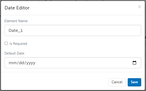
3. The field editor allows you to customize this field. Click "Save" afterward to save your edits.
- Element Name: All fields must have a unique name and cannot contain spaces or hyphens; only letters, numbers, and underscores are allowed in element names. This name is not shown to your participants. If you export this template's completed e-documents, this Element Name is what is used for the column that will have this field's data.
- Is Required: Check this box if you want this field to be required to be filled out in order to submit the e-document. This will make a red dot appear next to it.
- Default Date: Select a date from the date picker (or enter a date) if you would like a default date to be selected.
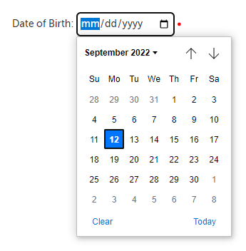
4. When the participant is filling out the document, they can click on the date field, for a date picker to appear.
Return to Top
Input Questions: Number
An input question involves typing by the e-document assignee. The number field checks for a valid integer.
1. Click on and hold the "Number" field on the right hand side, drag it to where you would like the field to appear in the document.

2. When you release the click, the field will appear. Click on it to make an editing panel appear next to it. The pencil icon is to edit the field, and the trash can icon is to delete it. Click on the pencil icon. (You can also click on the pencil or trash can icons that appear in the main toolbar.)

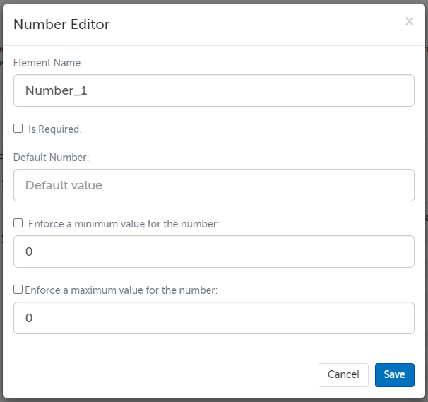
3. The field editor allows you to customize this field. Click "Save" afterward to save your edits.
- Element Name: All fields must have a unique name and cannot contain spaces or hyphens; only letters, numbers, and underscores are allowed in element names. This name is not shown to your participants. If you export this template's completed e-documents, this Element Name is what is used for the column that will have this field's data.
- Is Required: Check this box if you want this field to be required to be filled out in order to submit the e-document. This will make a red dot appear next to it.
- Default Number: Enter a number here if you want a default value for this field.
- Enforce a minimum value for the number: Check this box if you want the number to have a minimum value, and enter that min value in the field below. (Negative values are allowed by default.)
- Enforce a maximum value for the number: Check this box if you want the number to have a maximum value, and enter that max value in the field below.
4. When the participant is filling out the document, they can click on the number field, to use the arrow buttons on it to scroll up or down, or type a number into the field.

Return to Top
Input Questions: Text Area
An input question involves typing by the e-document assignee. A text area field will allow your participant to submit multi-line answers.
1. Click on and hold the "Text Area" field on the right hand side, drag it to where you would like the field to appear in the document.

2. When you release the click, the field will appear. Click on it to make an editing panel appear next to it. The pencil icon is to edit the field, and the trash can icon is to delete it. Click on the pencil icon. (You can also click on the pencil or trash can icons that appear in the main toolbar.)

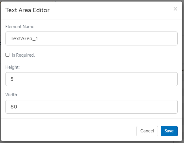
3. The field editor allows you to customize this field. Click "Save" afterward to save your edits.
- Element Name: All fields must have a unique name and cannot contain spaces or hyphens; only letters, numbers, and underscores are allowed in element names. This name is not shown to your participants. If you export this template's completed e-documents, this Element Name is what is used for the column that will have this field's data.
- Is Required: Check this box if you want this field to be required to be filled out in order to submit the e-document. This will make a red dot appear next to it.
- Height: The number of row pixels high.
- Width: The number of column pixels wide.
4. When the participant is filling out the document, they can type text into the field. They can also drag the lower right hand corner to change the shape of the box.

Return to Top
Input Questions: Textbox
An input question involves typing by the e-document assignee. A textbox field will allow your participant to submit single-line answers.
1. Click on and hold the "Text Box" field on the right hand side, drag it to where you would like the field to appear in the document.

2. When you release the click, the field will appear. Click on it to make an editing panel appear next to it. The pencil icon is to edit the field, and the trash can icon is to delete it. Click on the pencil icon. (You can also click on the pencil or trash can icons that appear in the main toolbar.)

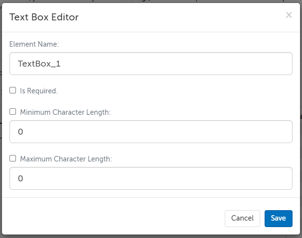
3. The field editor allows you to customize this field. Click "Save" afterward to save your edits.
- Element Name: All fields must have a unique name and cannot contain spaces or hyphens; only letters, numbers, and underscores are allowed in element names. This name is not shown to your participants. If you export this template's completed e-documents, this Element Name is what is used for the column that will have this field's data.
- Is Required: Check this box if you want this field to be required to be filled out in order to submit the e-document. This will make a red dot appear next to it.
- Minimum Character Length: The minimum number of characters you want to allow.
- Maximum Character Length: The maximum number of characters you want to allow.
- For a phone number, you can set the minimum and maximum to "10", to force the entry of a 10 digit phone number (3 characters for the area code and 7 characters for the phone number). Depending on your use case, you may want a separate textbox for phone extensions, or non-US/Canadian phone numbers.
4. When the participant is filling out the document, they can type text into the field.

Return to Top
Select Questions: Checkbox (Multiple Choice)
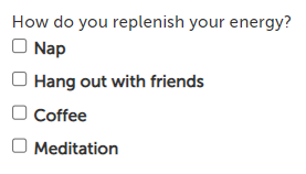
A select question involves the e-document assignee selecting choices already set in the template. A checkbox question will allow your participant to select one or multiple answers.
1. Click on and hold the "Checkbox (Multiple Choice)" field on the right hand side, drag it to where you would like the field to appear in the document.
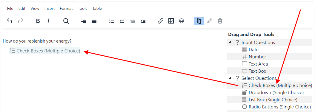
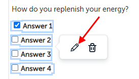
2. When you release the click, the field will appear. Click on it to make an editing panel appear next to it. The pencil icon is to edit the field, and the trash can icon is to delete it. Click on the pencil icon. (You can also click on the pencil or trash can icons that appear in the main toolbar.)
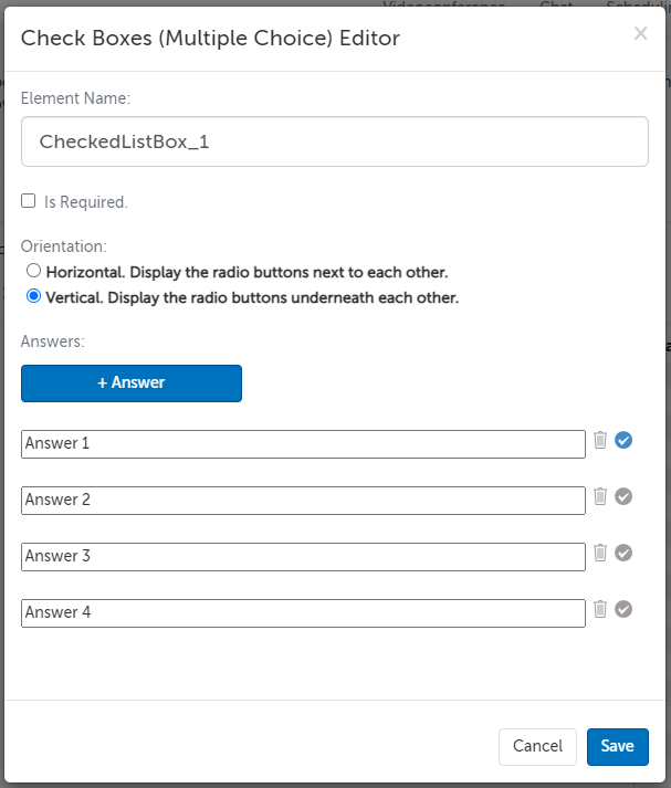
3. The field editor allows you to customize this field. Click "Save" afterward to save your edits.
- Element Name: All fields must have a unique name and cannot contain spaces or hyphens; only letters, numbers, and underscores are allowed in element names. This name is not shown to your participants. If you export this template's completed e-documents, this Element Name is what is used for the column that will have this field's data.
- Is Required: Check this box if you want this field to be required to be filled out in order to submit the e-document. This will make a red dot appear next to it.
- Orientation: What direction do you want the questions to be listed?
- Horizontal. Display the radio buttons next to each other.
- Vertical. Display the radio buttons underneath each other.
- Answers:
- Use the "+Answer" button add additional choices for the checkboxes.
- Replace the text in the placeholder fields to provide the choices you want the assignee to pick from.
- Use the trash can icon to the right of any placeholder field to delete that choice.
- Use the checkmark icon to the right of any placeholder field to make that choice checked by default.
4. When the participant is filling out the document, they can check any of the available boxes.
Return to Top
Select Questions: Dropdown (Single Choice)
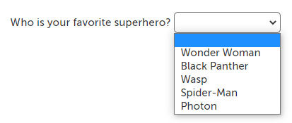
A select question involves the e-document assignee selecting choices already set in the template. A dropdown question will allow your participant to select only one answer, and the other choices are not visible.
1. Click on and hold the "Dropdown (Single Choice)" field on the right hand side, drag it to where you would like the field to appear in the document.
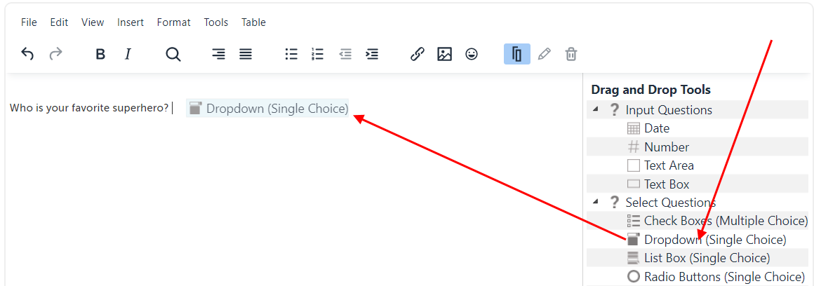
2. When you release the click, the field will appear. Click on it to make an editing panel appear next to it. The pencil icon is to edit the field, and the trash can icon is to delete it. Click on the pencil icon. (You can also click on the pencil or trash can icons that appear in the main toolbar.)

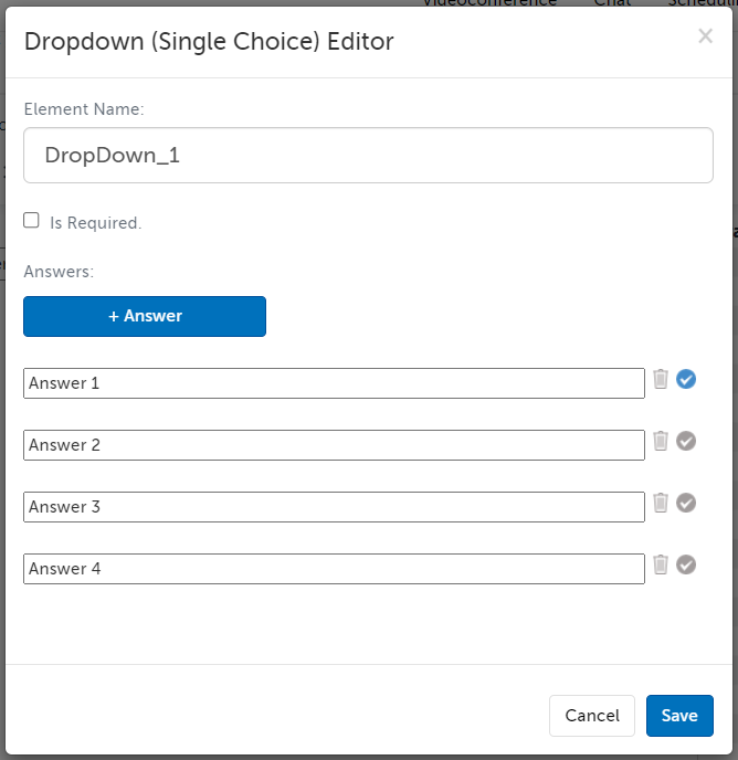
3. The field editor allows you to customize this field. Click "Save" afterward to save your edits.
- Element Name: All fields must have a unique name and cannot contain spaces or hyphens; only letters, numbers, and underscores are allowed in element names. This name is not shown to your participants. If you export this template's completed e-documents, this Element Name is what is used for the column that will have this field's data.
- Is Required: Check this box if you want this field to be required to be filled out in order to submit the e-document. This will make a red dot appear next to it.
- Answers:
- Use the "+Answer" button add additional choices for the checkboxes.
- Replace the text in the placeholder fields to provide the choices you want the assignee to pick from.
- Use the trash can icon to the right of any placeholder field to delete that choice.
- Use the checkmark icon to the right of any placeholder field to make that choice checked by default.
- If you do not have a default choice, then the default will be a blank answer.
4. When the participant is filling out the document, they can select one of the available choices.
Return to Top
Select Questions: List Box (Single Choice)
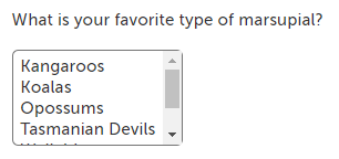
A select question involves the e-document assignee selecting choices already set in the template. A list box question will allow your participant to select only one answer. Four choices will be visible, but additional choices can be seen by scrolling through the box.
1. Click on and hold the "List Box (Single Choice)" field on the right hand side, drag it to where you would like the field to appear in the document.
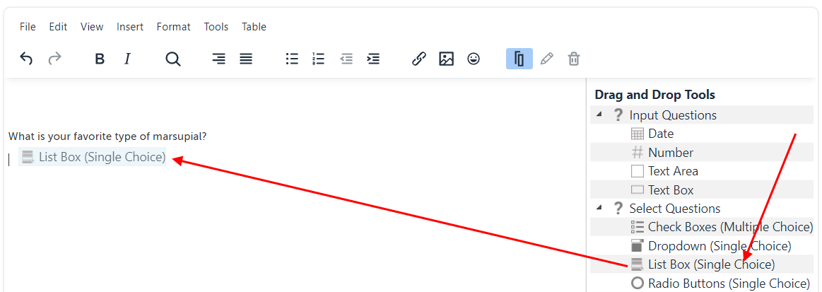
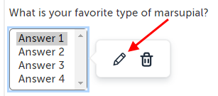
2. When you release the click, the field will appear. Click on it to make an editing panel appear next to it. The pencil icon is to edit the field, and the trash can icon is to delete it. Click on the pencil icon. (You can also click on the pencil or trash can icons that appear in the main toolbar.)
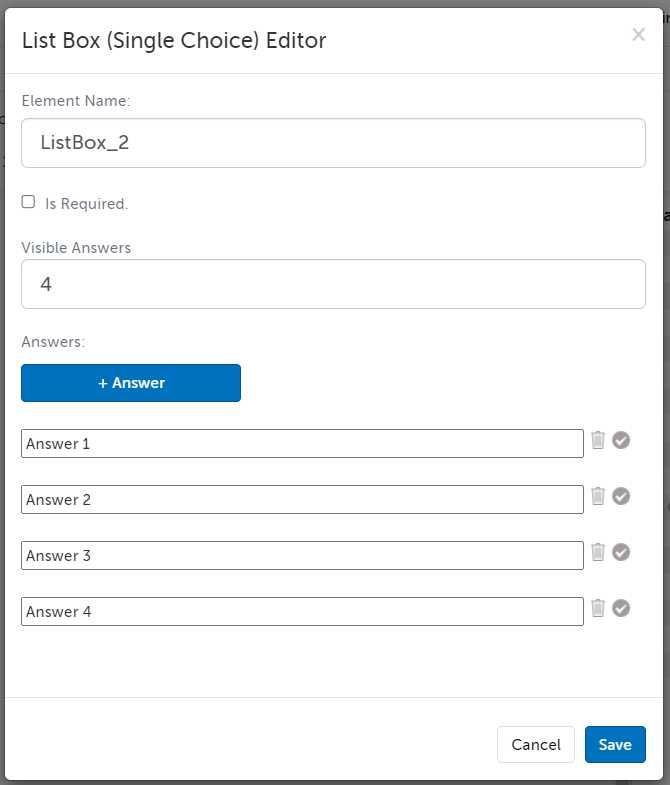
3. The field editor allows you to customize this field. Click "Save" afterward to save your edits.
- Element Name: All fields must have a unique name and cannot contain spaces or hyphens; only letters, numbers, and underscores are allowed in element names. This name is not shown to your participants. If you export this template's completed e-documents, this Element Name is what is used for the column that will have this field's data.
- Is Required: Check this box if you want this field to be required to be filled out in order to submit the e-document. This will make a red dot appear next to it.
- Visible Answers: Enter the number of answers that you want to be visible in the box. (If there are more answers than are immediately visible, the assignee can still scroll through the box to view other answers.)
- Answers:
- Use the "+Answer" button add additional choices for the checkboxes.
- Replace the text in the placeholder fields to provide the choices you want the assignee to pick from.
- Use the trash can icon to the right of any placeholder field to delete that choice.
- Use the checkmark icon to the right of any placeholder field to make that choice checked by default.
4. When the participant is filling out the document, they can select one of the available choices, and scroll to view other choices in the box.
Return to Top
Select Questions: Radio Buttons (Single Choice)
A select question involves the e-document assignee selecting choices already set in the template. A radio buttons question will allow your participant to select only one answer.
1. Click on and hold the "Radio Buttons (Single Choice)" field on the right hand side, drag it to where you would like the field to appear in the document.
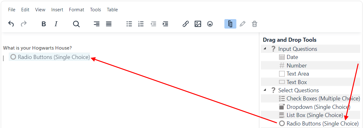
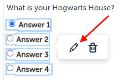
2. When you release the click, the field will appear. Click on it to make an editing panel appear next to it. The pencil icon is to edit the field, and the trash can icon is to delete it. Click on the pencil icon. (You can also click on the pencil or trash can icons that appear in the main toolbar.)
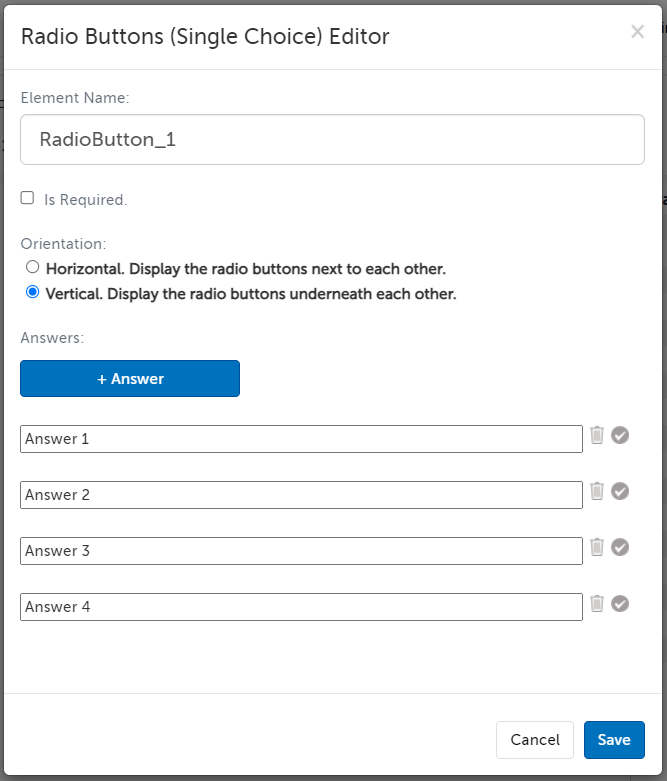
3. The field editor allows you to customize this field. Click "Save" afterward to save your edits.
- Element Name: All fields must have a unique name and cannot contain spaces or hyphens; only letters, numbers, and underscores are allowed in element names. This name is not shown to your participants. If you export this template's completed e-documents, this Element Name is what is used for the column that will have this field's data.
- Is Required: Check this box if you want this field to be required to be filled out in order to submit the e-document. This will make a red dot appear next to it.
- Orientation: What direction do you want the questions to be listed?
- Horizontal. Display the radio buttons next to each other.
- Vertical. Display the radio buttons underneath each other.
- Answers:
- Use the "+Answer" button add additional choices for the checkboxes.
- Replace the text in the placeholder fields to provide the choices you want the assignee to pick from.
- Use the trash can icon to the right of any placeholder field to delete that choice.
- Use the checkmark icon to the right of any placeholder field to make that choice checked by default.
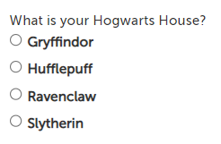
4. When the participant is filling out the document, they can select one of the available choices, and scroll to view other choices in the box.
Return to Top
Fields: Host Name
A placeholder field is automatically replaced with the applicable name. The "Host Name" placeholder field will be replaced with the name of the host of the session.
1. Click on and hold the "Host Name" field on the right hand side, drag it to where you would like the field to appear in the document.
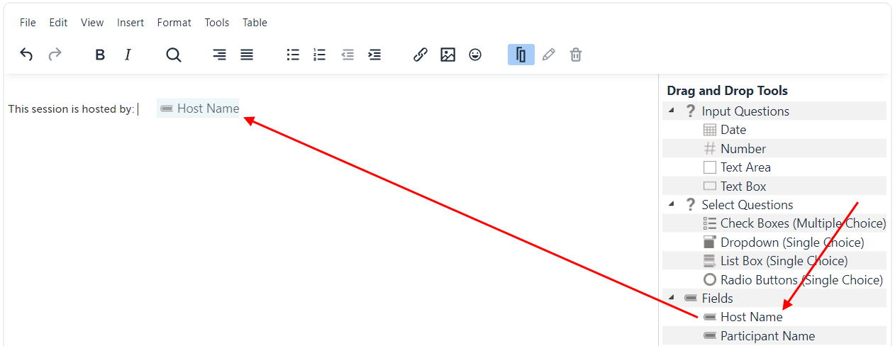
2. This will add "HostName" in square brackets.

3. When this document is shown to a participant, the bracket section will be replaced by the name of the host of the session. (When previewing the template, we use "Anne S. Host" as the example name.)

Return to Top
Fields: Participant Name
A placeholder field is automatically replaced with the applicable name. The "Participant Name" placeholder field will be replaced with the name of the participant filling out the e-document.
1. Click on and hold the "Participant Name" field on the right hand side, drag it to where you would like the field to appear in the document.
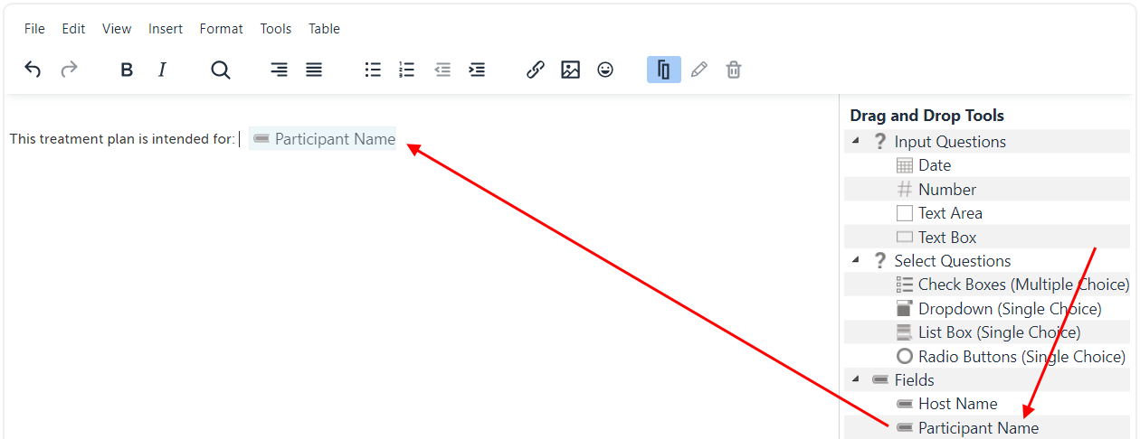
2. This will add "ParticipantName" in square brackets.

3. When this document is shown to a participant, the bracket section will be replaced by the name of the participant assigned to fill out this e-document. (When previewing the template, we use "John Q. Participant" as the example name.)

Return to Top
Miscellaneous Questions: File
The File field allows for a single image upload. You can add multiple File fields to allow for multiple image uploads.
Common uses for this feature include uploading proof of identification, insurance card, and relevant medical images.
1. Click on and hold the "File" field on the right hand side, drag it to where you would like the field to appear in the document.
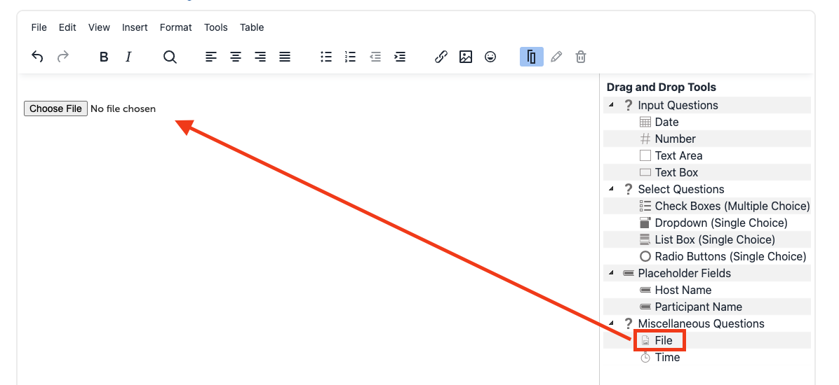
This is how it will appear to Users filling out the document:

Once a file has been uploaded, the user will see a preview of their selected image, along with the options to "Change" or "Remove" it. If neither, they can proceed with submitting the document.

Miscellaneous Questions: Time
The time field allows a participant to select a time.
1. Click on and hold the "Time" field on the right hand side, drag it to where you would like the field to appear in the document.
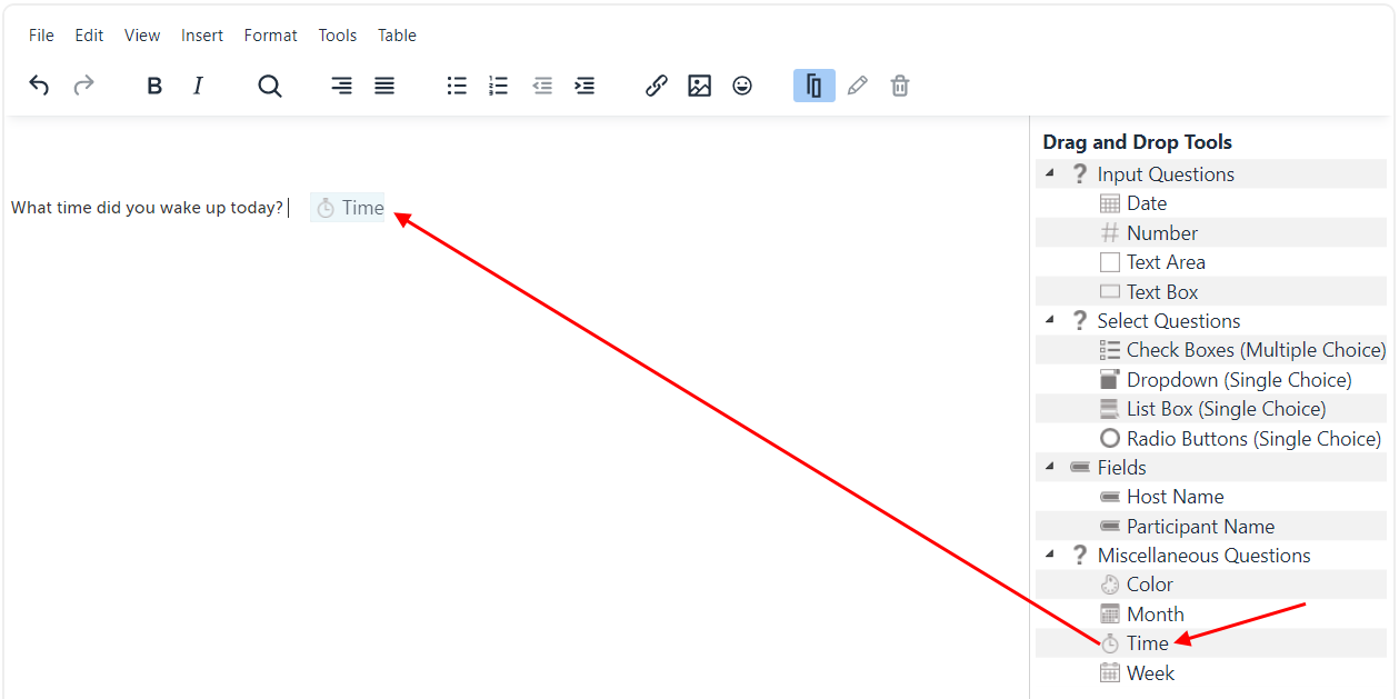
2. When you release the click, the field will appear. Click on it to make an editing panel appear next to it. The pencil icon is to edit the field, and the trash can icon is to delete it. Click on the pencil icon. (You can also click on the pencil or trash can icons that appear in the main toolbar.)

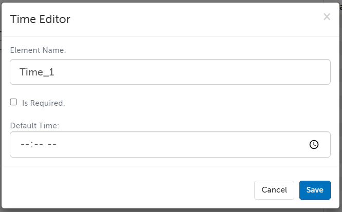
3. The field editor allows you to customize this field. Click "Save" afterward to save your edits.
- Element Name: All fields must have a unique name and cannot contain spaces or hyphens; only letters, numbers, and underscores are allowed in element names. This name is not shown to your participants. If you export this template's completed e-documents, this Element Name is what is used for the column that will have this field's data.
- Is Required: Check this box if you want this field to be required to be filled out in order to submit the e-document. This will make a red dot appear next to it.
- Default Time: Select a time if you want this field to be pre-populated (the participant can still select a different one).
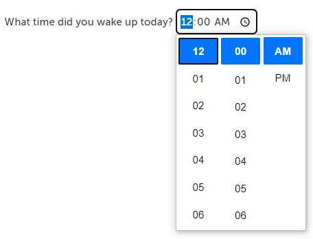
4. When the participant is filling out the document, they can use the buttons to pick a time, or type into the field.
Return to Top
This article was last reviewed by our Support team on December 6, 2024.